What Makes a Color Palette Visually Pleasing?
Ever stumbled across an image, brand, or journal layout and thought, “That just looks… perfect”? Chances are, it wasn’t just the subject or lighting—it was the color palette. Visually pleasing color combinations have a way of calming the brain, pulling in attention without overwhelming the senses. But what actually makes a color palette feel so satisfying?
This article explores the psychology and design science behind harmonious colors—and how you can use those insights to create your own soothing, aesthetically pleasing visuals.
The Psychology of Color Harmony
At its core, a color palette is a group of colors that work well together. But the brain doesn’t just process them visually—it responds emotionally. When colors are arranged in a way that feels natural, balanced, and cohesive, the mind relaxes. There’s no tension, no confusion—just visual clarity.
This state is known as color harmony, and it taps into both our biological instincts and cultural conditioning. We associate certain colors with emotions, memories, and moods. When those colors are paired thoughtfully, they guide our emotional state—often without us realizing it.
Why Certain Color Palettes Feel So Good
Here are the key psychological and visual factors that make a palette truly satisfying:
1. Low Visual Tension
Colors that are too contrasting or loud can trigger visual stress. Harmonious palettes use tones with similar saturation or brightness to create a sense of ease and flow.
2. Natural Inspiration
Palettes based on nature (think oceans, sunsets, florals) feel familiar and safe. These colors often mimic evolutionary safe zones—places we associate with shelter, food, and peace.
3. Consistent Mood
A palette feels cohesive when all the colors support the same emotional tone. A warm, earthy palette evokes grounding and stability. A cool pastel palette evokes softness and peace. Mixing opposite moods can feel jarring.
4. Balance of Warm and Cool
Many satisfying palettes use a subtle mix of both warm and cool tones. This creates balance, like mixing a lavender (cool) with a soft peach (warm). The contrast isn’t loud—it’s complementary.
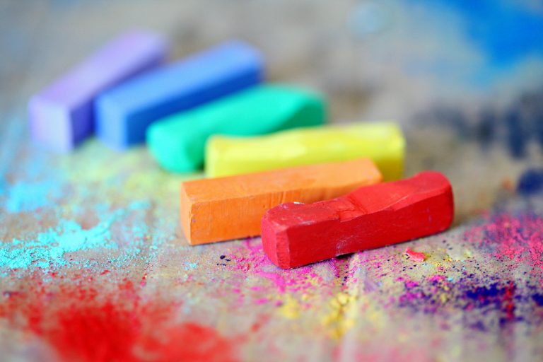
Types of Soothing Color Palettes
Here are a few palette styles often used in calming visuals, journals, branding, and wellness content:
Monochromatic
A single color in varying shades (like soft rose, dusty rose, and mauve).
Why it works: It creates visual depth while staying consistent.
Analogous
Colors that sit next to each other on the color wheel (like mint, teal, and seafoam).
Why it works: These colors feel related, like siblings—they blend naturally.
Pastel Mix
Soft versions of multiple hues (lavender, peach, butter yellow, baby blue).
Why it works: Pastels are gentle on the eyes and evoke emotional calm.
Earth Tones
Colors like terracotta, sage, cream, and stone.
Why it works: These feel rooted, stable, and warm—perfect for cozy or grounded moods.
Neutral with a Pop
A soft base (white, beige, taupe) paired with one playful color (like lilac or blush).
Why it works: It’s minimalist but still expressive.
How to Create a Visually Pleasing Palette
Want to create your own soothing palette for your journal, website, or creative work? Try this simple guide:
Step 1: Pick Your Base Emotion
Ask yourself: What do I want this to feel like?
Calm? Warm? Joyful? Nostalgic? Each emotion can guide your color choices.
Step 2: Choose a Dominant Hue
Start with one main color that reflects your goal. For calm, it might be soft blue. For warmth, maybe apricot.
Step 3: Add 2–4 Supporting Colors
Choose colors that complement your main tone in either warmth, saturation, or shade. Avoid anything that fights for attention.
Step 4: Test it Together
Put your colors side by side in blocks, strokes, or shapes. Do they flow? Or does one stick out too much? Adjust as needed.
Step 5: Use Neutrals to Ground the Palette
Always balance your brighter or softer tones with a neutral (white, cream, gray, soft brown) to create contrast and breathing space.
When Color Palettes Support Mental Wellness
If you’re someone who gets overwhelmed by visual clutter, intentional color palettes can act like visual medicine. Whether you’re organizing your desktop, decorating a room, or designing content, a thoughtful palette can:
- Reduce overstimulation
- Help organize your thoughts visually
- Set the mood for focus, rest, or creativity
- Give you a sense of control and clarity
Final Thoughts
Visually pleasing palettes aren’t just trendy—they’re therapeutic. They work like visual affirmations, helping the brain feel balanced, safe, and in sync. Whether you’re building a pastel Pinterest board, painting a mood canvas, or redesigning your space, let your color choices reflect the feelings you want to invite in.
Because at the end of the day, harmony isn’t just for the eye—it’s for the mind, too.
For more ways to slow down and reset, keep coming back to SootheSync.