The Link Between Color and Memory Recall
Have you ever noticed how certain colors instantly remind you of a specific moment, place, or feeling? Maybe a pale blue reminds you of your grandmother’s kitchen curtains, or a deep red makes you think of your favorite childhood book cover. This isn’t just nostalgia—it’s neuroscience.
Color doesn’t just decorate our world—it shapes how we remember it. In this article, we’ll explore how color influences memory recall, emotional attachment, and why some shades seem to stick in our minds more than others.
The Brain’s Relationship With Color and Memory
Our brains are wired to associate meaning with visuals, and color is one of the most emotionally loaded visual elements we process. When you encounter a color—especially in a meaningful or emotionally charged moment—it gets linked to the context of that memory.
Here’s how it works:
- The visual cortex processes the color.
- The hippocampus (responsible for memory) and amygdala (responsible for emotion) form connections between what you saw, how you felt, and what was happening.
That’s why colors often act as emotional bookmarks, helping you return to a moment more vividly than words or numbers ever could.
How Color Enhances Memory
Studies in cognitive psychology show that people are more likely to remember information when it’s presented in colorful, high-contrast formats—especially when the colors are emotionally resonant or visually distinct.
Here’s why:
- Color captures attention and improves focus.
- Emotional colors (like red or orange) increase alertness, helping the brain absorb details more effectively.
- Calming colors (like blue and green) enhance retention by reducing cognitive overload.
This is why teachers use color-coded notes, why brands choose signature hues, and why journal layouts often include soft palettes—because color helps lock in meaning.
Emotionally Charged Colors and Memory Recall
Certain colors have stronger emotional and memory ties due to their intensity or cultural associations. These colors are more likely to embed themselves into long-term memory:
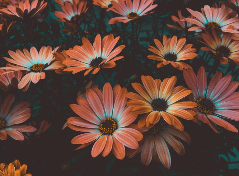
Red – Alertness and Importance
Red is often linked to danger, urgency, or passion. It triggers fast responses and can enhance memory for details when used sparingly. But too much red can also create anxiety or tension.
Blue – Clarity and Focus
Blue is known to improve cognitive performance and working memory. It doesn’t overstimulate the mind, which is why it’s often used in environments meant for studying or deep concentration.
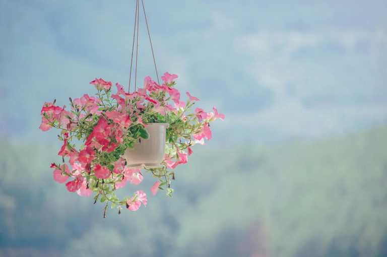
Green – Balance and Recall
Green supports relaxed attention, making it easier to absorb and retrieve information. It’s associated with nature and safety, so it reduces stress-related memory blocks.
Yellow – Creativity and Optimism
Yellow increases mental stimulation and optimism, which supports associative memory—where ideas and emotions are linked together.
Purple – Emotional and Spiritual Memory
Purple is less common in nature, which makes it feel unique. It’s often remembered in contexts of creativity, mystery, or spirituality.
Color and Long-Term Memory Triggers
The strongest color-based memories are usually tied to:
- Emotionally significant experiences (like a wedding dress, childhood room, or school uniform)
- Repeated exposure (a brand logo you see every day)
- Contrast and uniqueness (bright objects in dull environments)
These visual moments don’t just stay in your memory—they become part of how you emotionally map your life.
Using Color to Improve Your Own Memory
Want to remember more clearly or connect emotionally with the moments you’re experiencing now? Here’s how you can use color to your advantage:
1. Color-Code Your Journal or Notes
Use different pastel shades to separate moods, topics, or themes. Soft pink for personal memories, light green for goals, blue for deep thoughts.
2. Create Visual Anchors
Use a specific color in your space while studying, journaling, or reflecting. Later, seeing that color elsewhere can help you recall what you were thinking or feeling at the time.
3. Use Color in Vision Boards and Mood Trackers
Assign colors to emotions or desires so your brain begins forming associations between them and your intentions.
4. Add Color to Routines
Use soft lighting, colored objects, or themed items during regular rituals (like using lavender-toned journaling tools before bed or golden-hued candles during your morning meditation).
The Risks of Overusing Color
Color is powerful—but too much of it can have the opposite effect. Overly saturated or clashing hues can create visual chaos, making it harder to focus or retain information.
To keep your memory clear and your mind calm:
- Stick to 2–4 colors per visual environment
- Use pastel or muted tones when working with emotional or reflective content
- Save bright colors for accents and important points
Final Thoughts
Color doesn’t just make our world more beautiful—it gives it meaning. It marks our memories, enhances focus, and creates deeper emotional connections to everyday moments. Whether you’re organizing your notes, designing your space, or simply trying to capture a mood, using color with intention can help you remember not just what happened—but how it felt.
So next time you’re trying to preserve a moment, don’t just take a picture—notice the colors.
For more ways to slow down and reset, keep coming back to SootheSync.