How Color Affects Our Mood and Mental State
Have you ever felt instantly calmer when surrounded by soft blues or more energized in a room filled with bright yellow? That’s not a coincidence—it’s color psychology in action. The colors we see can have a powerful impact on how we think, feel, and even behave. When it comes to visual satisfaction, color plays one of the biggest roles in shaping our emotional responses.
The Science of Color Perception
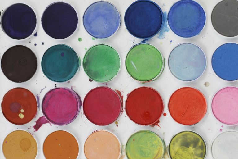
Color isn’t just a visual experience—it’s also psychological. Our brains associate different hues with specific emotions based on personal experiences, cultural influences, and even biological responses. While preferences vary, certain colors tend to trigger consistent emotional reactions across many people.
Calming Colors: Blue, Green, and Lavender
Cool tones are known for their ability to relax and ground us.
- Blue is often associated with trust, peace, and clarity. It slows down heart rate and breathing, making it ideal for stress relief.
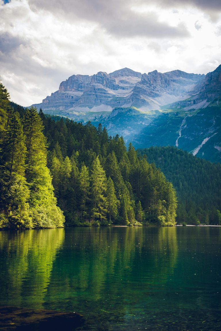
- Green, the color of nature, evokes balance and renewal. It creates a sense of freshness and safety.
- Lavender combines the calm of blue and the softness of pink, often used in therapeutic spaces to ease anxiety and support emotional regulation.
These colors are common in wellness content because they instantly create a tranquil visual environment.
Energizing Colors: Yellow, Orange, and Coral
On the other end of the spectrum, warm colors stimulate the brain and body.
- Yellow boosts mood and optimism—it mimics the sun and can increase alertness.
- Orange creates excitement and creativity but can become overstimulating if used in excess.
- Coral offers a balance between calm and energy, making it ideal for maintaining a light, joyful tone.
These hues are often used to encourage productivity, motivation, or joy—especially in morning routines or playful content.
The Impact of Neutrals and Pastels
Neutrals like beige, cream, soft gray, and taupe offer a grounded, minimal look. They don’t overwhelm the senses and provide space for the mind to relax.
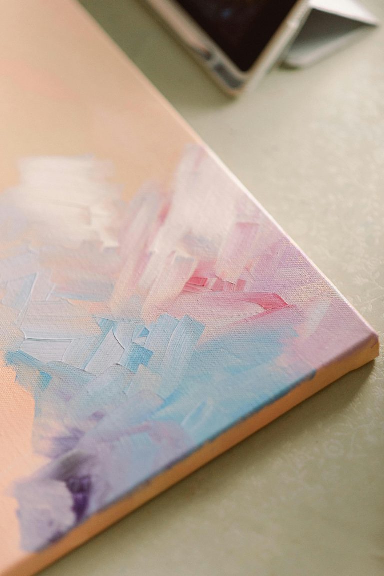
Pastels—muted pinks, blues, and greens—are incredibly popular in calming visual content. They soften the emotional impact of bolder shades and often feel nostalgic, cozy, and safe.
Using Color to Shape Your Environment
Whether you’re designing a room, curating a vision board, or editing your Pinterest feed, you can use color intentionally to support your emotional needs.
- Need rest? Lean into pale blues and neutrals.
- Feeling anxious? Add some muted green or soft lavender.
- Need a pick-me-up? Incorporate cheerful yellow or peach.
Mindfully choosing the colors around you can turn your everyday visuals into a form of therapy.
Final Thoughts
Color affects more than your aesthetic—it influences how you feel. By understanding the emotional language of color, you can create visuals that aren’t just beautiful, but also healing. It’s one more way to take control of your mental space and turn your screen time into a moment of peace.
For more ways to slow down and reset, keep coming back to SootheSync.