The Psychology of Color: Why Certain Hues Instantly Calm Us
The Psychology of Color: Why Certain Hues Instantly Calm Us
Color is one of the most powerful elements of visual design—and not just because it looks nice. It has the ability to trigger emotional responses, influence our decisions, and most importantly, regulate our mood. You’ve probably noticed how certain spaces feel more peaceful than others, or how some outfits instantly make you feel grounded. Much of that has to do with the colors involved.
Let’s take a deeper look into the psychology of color and how calming hues work quietly behind the scenes to help us relax, reset, and feel a little more at peace.
How the Brain Responds to Color
When our eyes perceive color, they’re doing much more than just registering light waves. The information gets processed in the visual cortex, and then interpreted by the hypothalamus, a small area of the brain that controls stress response, emotion, hormone levels, and even sleep patterns.
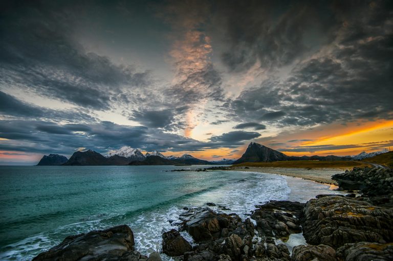
This is why something as simple as looking at a soft green wall or pale blue sky can lower your heart rate and calm your nervous system. These reactions are not just psychological—they’re physiological. Color has a direct impact on how our bodies feel.
Calming Colors and Their Psychological Effects
Let’s explore some of the most universally calming colors and how each one affects our mental and emotional state:
Blue: The Color of Calm and Clarity
Blue is one of the most calming colors in the spectrum. It’s often linked to feelings of peace, tranquility, and emotional balance. Lighter shades like baby blue or sky blue are commonly used in meditation spaces, wellness spas, and bedrooms because they can slow down your breathing and reduce feelings of anxiety. Blue is also known to enhance focus and encourage deep thinking, which is why it’s popular in learning environments and workspaces.
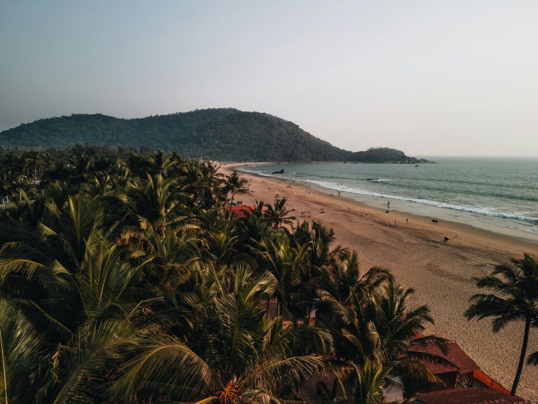
Green: The Color of Nature and Renewal
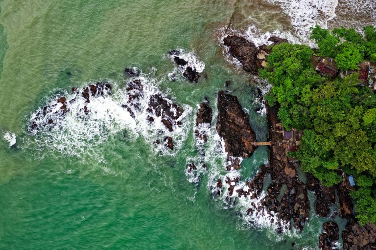
Green evokes strong connections to the natural world. It’s the color of trees, grass, and growing things, which makes it a symbol of balance, growth, and renewal. Green has been shown to lower blood pressure, reduce muscle tension, and ease the mind, making it a powerful choice for places where people go to relax or recharge. It also reduces eye strain, which is why it’s often used in digital design for background hues.
Lavender: The Subtle Blend of Calm and Warmth
Lavender blends the cool calm of blue with the energetic warmth of red, resulting in a gentle color that soothes without making the viewer feel cold or detached. Psychologically, lavender represents a delicate balance between rest and emotional warmth. It’s often associated with self-compassion, healing, and mindfulness, making it perfect for journaling spaces or self-care products.
Soft Pink: Gentle and Nurturing
While bold pinks can energize, pastel pinks have the opposite effect. They’re often linked to safety, softness, and unconditional care. Light pink is used in environments designed to reduce aggression and promote calm. Its nurturing quality makes it a great choice for cozy bedrooms, baby nurseries, and personal sanctuaries.
Why These Colors Feel So Good
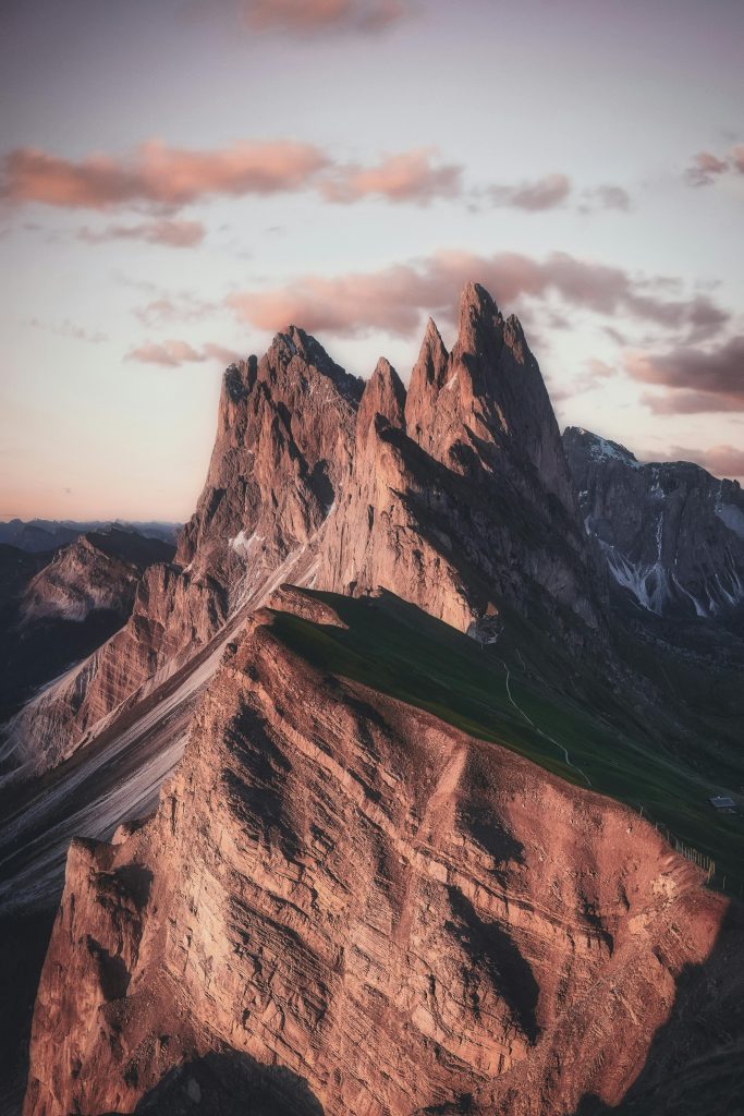
Part of our response to calming colors is evolutionary. In prehistoric times, blue skies and green landscapes were signs of safety and survival—indicators that food, shelter, and water were nearby. Our nervous systems associate those colors with security and stillness, even now.
Another piece of the puzzle is cultural conditioning. Throughout our lives, we absorb messages about color from media, advertising, and even childhood experiences. If blue was the color of your favorite blanket or lavender reminds you of a comforting bath, your brain holds onto those associations and reactivates them when you encounter the same shades.
How to Use Calming Colors in Daily Life
Color doesn’t just belong on walls—it belongs in every part of our lives. Here’s how you can intentionally bring calming hues into your daily routine:
In Your Environment
- Paint your walls in soft tones like seafoam green, pale blue, or lavender.
- Use pastel bedding and curtains in your bedroom to encourage rest.
- Add plant life to your space for pops of green and natural visual balance.
In Your Digital Life
- Choose calming backgrounds for your phone, tablet, or desktop.
- Set up a digital vision board with soothing hues to inspire focus and peace.
- Use pastel filters or editing styles in your photos to maintain a cohesive, calming aesthetic.
In Your Clothing and Self-Expression
- Wear soft tones when you need to feel more centered or emotionally safe.
- Choose calming colors for accessories like bags, water bottles, or journals.
In Your Creative Practices
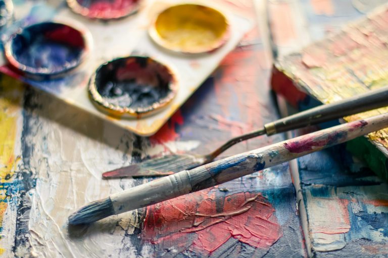
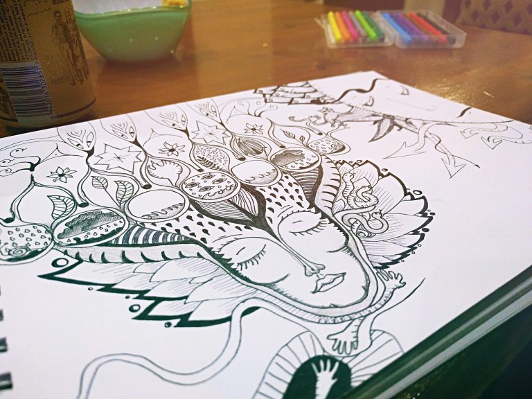
- Incorporate gentle hues into your artwork, bullet journaling, or coloring pages.
- Try painting or sketching with watercolors in soothing shades to reduce tension.
When to Be Mindful of Color Overload
While color can be soothing, too much stimulation—even from beautiful shades—can overwhelm the senses. If you’re someone who feels drained by visual clutter, avoid combining too many bright or contrasting hues in one space. Stick to a minimal palette of soft, harmonious tones to give your eyes room to rest and your mind space to breathe.
Final Thoughts
Color is more than just an aesthetic choice—it’s a powerful, emotional tool. From reducing anxiety to promoting focus, the colors we surround ourselves with influence how we think, feel, and even heal. Whether it’s the powder blue of a sunrise sky or the mint green of your favorite mug, small choices in color can create big shifts in your emotional world.
So the next time you want to calm your thoughts or reset your mood, try turning to color. Let it support your peace in the background, quietly and consistently.
For more ways to slow down and reset, keep coming back to SootheSync.