The Power of Pastels: Soft Color Psychology Explained
Pastel colors are more than just pretty—they’re psychologically powerful. These soft, muted shades have taken over everything from wellness branding and Pinterest feeds to cozy bedrooms and journaling spreads. But why do pastels feel so calming, gentle, and emotionally safe?
In this article, we’ll explore the psychological effects of pastel tones and why they have such a strong connection to peace, softness, and self-regulation.
What Are Pastels?
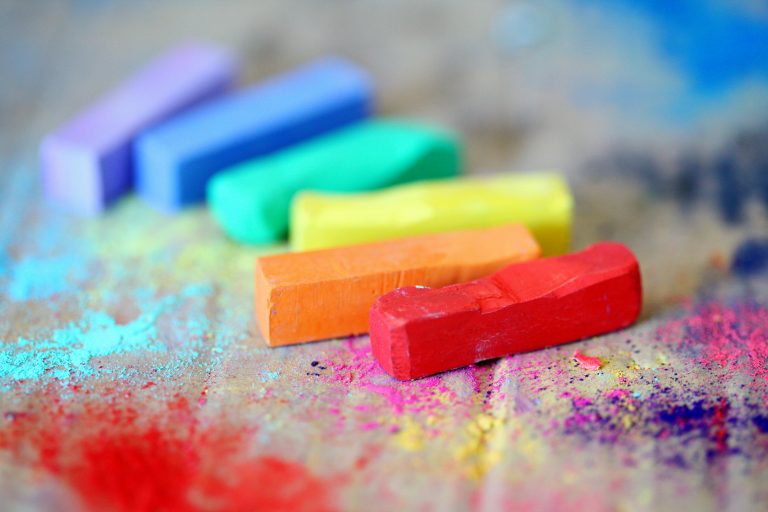
Pastel colors are created by adding white to pure hues, resulting in lighter, softer versions of standard colors. Examples include:
- Baby blue
- Lavender
- Peach
- Mint green
- Soft pink
- Pale yellow
Pastels are low in saturation and high in brightness, which makes them visually gentle and easy on the eyes. Unlike bold, neon, or dark tones, pastels don’t demand attention—they invite you in quietly.
Why Pastels Feel Emotionally Safe
When you see pastel colors, your brain doesn’t react with alertness or urgency. Instead, it softens. That’s because pastel tones create a low-stimulation visual experience. They don’t activate your nervous system the way intense or high-contrast visuals do.
This is especially soothing for people who are:
- Emotionally overstimulated
- Visually sensitive
- Neurodivergent (such as those with ADHD or autism)
- Feeling anxious or drained
Pastels tell the brain: “There’s no need to be on guard.” That alone can lead to a subtle shift in how you breathe, think, and feel.
The Psychology Behind Specific Pastel Shades
Different pastel colors carry their own unique emotional messages. Here’s how some of the most popular ones affect the mind:
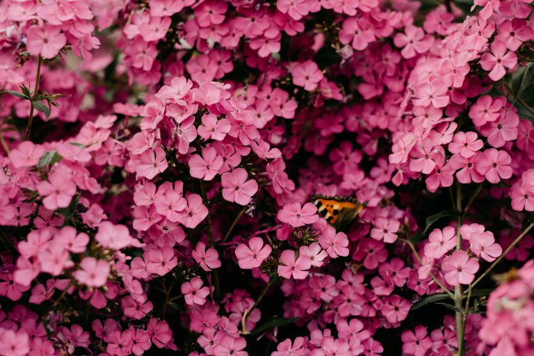
Soft Pink – Nurturing and Comforting
Soft pink is associated with tenderness, care, and emotional warmth. It often reminds us of affection, safety, or childhood. This color is commonly used in self-care spaces and products for its ability to soothe and emotionally regulate.
Baby Blue – Peaceful and Open
Light blue feels expansive, like a clear sky. It evokes calm, trust, and emotional clarity. Baby blue is ideal for creating environments that encourage breathing room and mental stillness.
Mint Green – Restorative and Refreshing
This gentle green tone is linked to renewal, balance, and calm. Mint green is perfect for workspaces or wellness branding, as it promotes stability and relaxation without feeling dull.
Lavender – Intuitive and Reflective
Lavender blends the stability of blue with the energy of red, creating a color often associated with imagination, reflection, and emotional softness. It’s a favorite in meditative and spiritual spaces for its healing, feminine energy.
Pale Yellow – Light and Uplifting
Pastel yellow feels like soft sunlight. It gently lifts the mood without overwhelming the senses. This color supports creativity, optimism, and emotional warmth, making it perfect for journaling or creative corners.
Why Pastels Work So Well in Wellness Design
Pastels are a visual expression of gentleness—a quality that aligns perfectly with emotional healing, self-care, and mindfulness. You’ll often find pastels in:
- Therapy offices and calming digital spaces
- Skincare packaging and holistic wellness branding
- Vision boards, bullet journals, and coloring pages
- Cozy, safe-feeling bedroom or workspace design
These tones help visually de-escalate emotions, making people feel more grounded, emotionally supported, and mentally clear.
How to Use Pastels to Soothe Your Mind
You don’t need to repaint your walls to experience the mental benefits of pastel psychology. Here are simple ways to incorporate them into your daily life:
1. In Your Environment
- Add pastel pillows, rugs, or candles to your space
- Use soft-hued desk accessories or bedding
- Create a pastel gallery wall for visual calm
2. In Your Digital Life
- Use pastel wallpapers and icons for your phone or desktop
- Follow creators who use pastel aesthetics in their videos
- Design calming Pinterest boards with soft-toned visuals
3. In Your Creative Practice
- Use pastel markers, paints, or digital brushes in your art
- Color with soothing shades to help regulate emotions
- Experiment with soft mood boards and color palettes
4. In Your Wardrobe and Self-Care Items
- Choose pastel clothing when you want to feel emotionally supported
- Opt for gentle-colored skincare packaging and beauty tools
- Match your journal or water bottle to a calming color scheme
When Pastels Are Especially Helpful
Pastel tones are particularly useful during:
- Anxiety spikes or emotional burnout
- Transitions between seasons (especially spring and fall)
- Low-energy days when you need gentle encouragement
- Creative blocks that need soft stimulation
- Nighttime wind-down routines or digital detox breaks
Final Thoughts
Pastels speak in whispers—not shouts. They give you permission to slow down, to soften, and to be emotionally safe in your space. Whether you’re designing your room, journaling before bed, or scrolling through calming visuals online, pastel colors can act like a gentle embrace for your nervous system.
Soft doesn’t mean weak. It means peaceful. It means safe. It means you’re giving your mind and body what they need to rest and reset.
For more ways to slow down and reset, keep coming back to SootheSync.